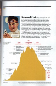
In the August 2014 National Geographic, the magazine does an interesting full-page graphic on the rise and decline of smoking, breaking down the smoking rate into “cigarettes per day.” (Click on the graphic to see it full size, I couldn’t find it on the Internet anywhere.)
The height of the smoking epidemic was 1965, when 42 percent of the population of the U.S. smoked, and the daily average of cigarettes smoked was 11.7.
The biggest spike in the smoking rate happened after WW II, and I’ve actually heard a logical reason for this. Millions of guys went overseas to war and a lot of them smoked; they were actually given cigarettes in their K-rations. Why? Well, because they all figured they were going to die anyways, so why not smoke? When they came back from war, they were hooked.
In the 50s, the smoking rate abated slightly, but not much, continuing to grow rapidly. Finally, in 1964, when the Surgeon General’s report came out on lung cancer, the pyramid reached its apex and flatlined (shockingly to me, the smoking rate actually went UP a tiny bit after the Surgeon General’s report came out)
When the smoking rate started to finally decline was the early 70s, National Geographic identifies this as “the beginning of the nonsmokers rights’ movement.” In 1986, came the Surgeon General’s report on secondhand smoke and in 1988, came the SG report on the addictiveness of nicotine.
(Surprisingly, this graphic doesn’t include the 1998 Master Settlement Agreement, which killed Joe Camel, and I think was a fairly major landmark in the battle against smoking and the tobacco industry).
By, 2011, the smoking rate had declined to 3.4 cigarettes a day per capita, with 19 percent of the population smoking. One thing I found interesting about this graphic was seeing how the smoking rate today is roughly equal to what it was around 1930.


